Sunday, October 18, 2009

No Rest for the Weary

Fall Break was Thursday and Friday of last week, providing a welcome period of rest and relaxation for the students. But with most students home for the long weekend - eating mom's food and catching up on laundry (and hopefully studying a little, too) - Fall Break was a great time to get some of the last big construction projects around the house done with as little interruption to the students' lives as possible.

The guys from Meyer Najem and their subcontractors clocked some serious hours to complete the last major work. Over the past few days, the kitchen floor was replaced, the parking lot paved and striped, the south addition was final cleaned, the back stairwell repainted, the new flooring waxed, and the temporary walls originally built to separate the construction areas from the existing house were removed. So much for a fall break!

I'm happy to say the work went smoothly and things are looking good for the students to occupy the south addition by the end of the month!

Shiny new kitchen floor.


The newly installed shutters will be painted in the next few days (too rainy last week).


The new dumpster gate will also be painted. Classiest trash on the block. :)


Newly paved and striped parking lot.

Wednesday, October 14, 2009

Home Stretch

Well, we're entering the final leg of this crazy construction journey. It has been a long road, but an interesting and exciting one as well. In the last few weeks, the student rooms in the south addition have been coming together quite nicely. The carpet was installed at the end of last week and final painting is in progress. The students are all really looking forward to moving into the rooms. Right now, we're shooting for full occupancy on October 31, making for a truly happy Halloween!


Eight person student room on floor two. The carpet, blue accent wall, wood trim, and closet door hardware is all new since the last pictures I posted.


Three person room in the basement.


The basement rooms are surprisingly bright and cheerful, thanks to large windows and window wells.


New "back" entrance to the house on the west side.

Sunday, October 4, 2009

Rewind Through Time

I'm proud to report that Delta Gamma won Homecoming 2009! WHOO HOO!

Homecoming is a really big deal at Butler. Really, really big. Last year I was completely caught off guard by all of the activity leading up to the homecoming game. During homecoming week, fraternities and sororities are paired together to participate in a full week of events. The different activities are judged by a committee and points are awarded based on execution, use of theme, and participation. A winner is announced at halftime of the football game.

When I started this job, I had no idea how involved homecoming week was... and how much was at stake, as DG has won homecoming for 11 of the last 12 years. Thankfully, I was a little more prepared this year. The theme was "Rewind Through Time: Homecoming 2009." DG, who was paired with Phi Kappa Psi, won all three of the big events: lawn decorations, the parade float, and the cheer competition (Yell like Hell). An enormous amount of work went into the planning, construction, and execution of all three, so I was proud of the students for giving it their all and doing an amazing job. What a fun week!


The giant homecoming banner - weighed down by greatness, perhaps? :)


We were so happy to welcome alumni back to the house on Saturday morning before the game. I suspect many alumni made a point to stop by the house specifically to see the summer renovations and check out the progress of the expansion. For those of you that weren't able to make it for homecoming, I hope these latest pictures of the construction will bring a little of the homecoming fun to you!


Renovated & redecorated foyer.


Installed student closet doors in the south addition.


The closet doors & frames come as a single unit for quick installation.


The caps on the sundeck railings have been installed and painted.


View of the south addition from 44th Street and the parking lots.


Complete brick on the south addition, with view of dining room addition. You can see some pieces of the homecoming float decorations in the parking lot.


South addition from the southeast corner of the property. The three-sided square in the front center of the picture is the dumpster enclosure.


New "back" entrance on the west side of the house. It's hard to tell in the picture, but there's a glass door on the first floor between the old house and addition. The door leads into the old back stairwell that runs between all the floors. The french doors lead into the new chapter room.


I tried to get a picture of the house from end-to-end (showing the whole west side), but I can't get back far enough to fit it all in the photo. I was standing in Tri Delt's lawn when I took this. The house is just THAT big now!

Friday, September 25, 2009

The Third Little Pig

Following the installation of limestone pieces that surround the new windows, a whole lot of brick was laid on the south addition in the last week. It is astounding how much brick was added, especially when you consider that each brick is placed individually. I didn't count exactly, but I think it took about 6 workdays for about 5 guys to complete the work. I'll take some more pictures as soon as it stops raining, but I wanted to share the first picture I got of the house looking so much more complete!

View of the southeast corner of the south addition.


Limestone and brick surrounding the windows of the existing house.


New limestone and brick surrounding a new window on the south addition. As you can see, it was designed to match the style of the original structure.

And these pictures have nothing to do with brick...

The dining room set for our first formal dinner. It was awesome to have space for everyone in attendance to sit and enjoy dinner in the same space!


Look what the students got me! Sooooo sweet!

Thursday, September 17, 2009

A New Chapter

There's almost too much going on here to find the time to blog, but I did manage to snap some pictures in the south addition while the construction workers were out to lunch! Good news: there is a first coat of paint on every floor, flooring already going down in the third floor, and wood trim/crown molding in several rooms. Also, the room and closet doors are being delivered on Friday, which are the last big items to arrive on site to keep the schedule moving along.

The first two pictures are of the new chapter room, a meeting room that stretches the width of the south addition. It's a nice long room with a few windows, french doors that lead to the back patio, and a storage closet for secret sorority stuff. :)

View towards the west end of the chapter room. Notice the ceiling trim, which conceals rope lighting. The black squares in the first bulkhead (top center of the picture) contain electrical wiring that will allow for a projector to be mounted on the ceiling.


View of the opposite end of the chapter room, currently piled with construction tools and supplies.


Mechanical room in the south addition. Five new A/C units and furnaces bring the total number of each in the house to 10!


I probably haven't posted pictures of this area yet. This is the new ADA-compliant bathroom on the first floor, just outside the kitchenette. The bathroom provides an accessible restroom for our guests with disabilities and any future residents who may require this accommodation.


Just another view of the same.

Thursday, September 10, 2009

Sunny Side Up

With the railings installed and only a little painting to be done, the new Sundeck is finally open! Thankfully we are still experiencing sunny and warm weather this fall so that the students (and their sunshine-addicted house mother) can enjoy the new space.

The Sundeck (also known to the construction workers as the Party Deck) was constructed over the "flat" roof above the new dining room. Actually, the roof has a very gentle slope to facilitate the runoff of water that would collect on a truly level surface. Study the picture below and you can see how the beige horizontal beam just above the top row of siding (and just under the gutters) is much taller by the brick than it is at the outer corner of the addition. It's cleverly disguised - but now you're in the know!


The deck area itself is level and made of a pre-treated, water-resistant lumber that will prevent warping and water damage without the hassle of yearly or bi-yearly staining/waterproofing. It's a very low maintenance product and it looks great. It's practical for this setting - but definitely not cheap at around $50/board.


One of the most common questions I get is "Why is only half of the roof surface a usable deck?" In the picture below, you can see that the deck is divided into two parts by a railing. One side is covered by the deck lumber and the other side is just the exposed rubber roof. Building and fire safety codes stipulate that, if there is only one point of egress, the maximum capacity for this type of space is 50 people. At one square foot per person, and with only one way to exit the space (the entry/exit door in the second floor hallway), the maximum area that can be occupied on DG's Sundeck is 50 square feet - plenty of space for sunning, relaxing, and escaping the everyday pressures of student life.

Wednesday, September 9, 2009

A Grand Entrance

You may remember me mentioning in the last post that the foyer was set to receive a bit of a remodel over Labor Day weekend. I sifted through my old pictures from the very end of the school year and managed to dig up a "before" photo of the foyer. It's not very good (and apparently I was getting ready to haul out some trash before taking this?), but you get the idea of what the foyer used to look like - white tile floor, white wallpaper, gold chandelier (with black mini-shades, though you can't see them in the pic).


Foyer - before


Here you can see what a dramatic change just flooring and a new fixture can make in the look of a room.

Foyer - 09/01/09


The problem with the partial remodel, though, was that then the wallpaper started to look a little shabby next to the shiny new flooring and a new chandelier. It seemed like every little tear or scratch or scuff in the paper was a giant blemish on the new entryway. And so, it had to come down:

Tearing down wallpaper is a messy process.


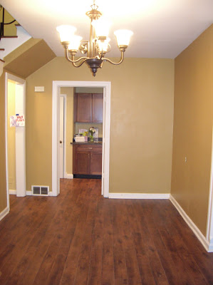
The end result is a much more modern look that more closely matches the newly remodeled house in style.

A rich gold color adds warmth to the space.


...And the rich red in the doorway adds a little drama.

More pics when the decor gets back on the walls.